Description
This block can display one or two products with text and a button under each image tile. All of the elements can be hidden or shown and are fully editable. The text areas consist of an item title or description, price, and button. Of course, the price element is not fixed and can be used for any text-based purpose. Images can be side by side in desktop and mobile view and stacked in mobile.
Notice
To keep the quality of image responsiveness in smaller devices a minimum width of between 480px / 520px will cover all responsive devices when stacking is on.
Images may then look oversized in Edit mode but look okay in Preview mode. Edit the text area before loading the image(s).
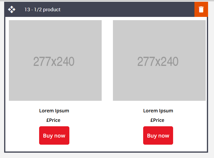
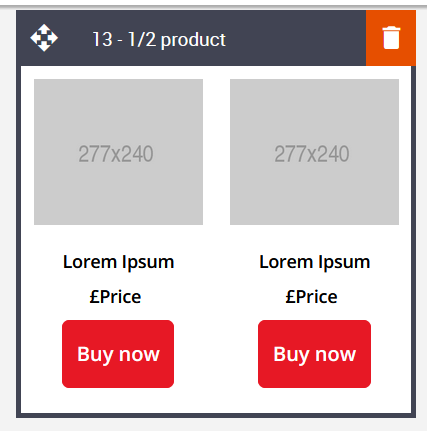
Default block view
Desktop
Mobile
Formatting options
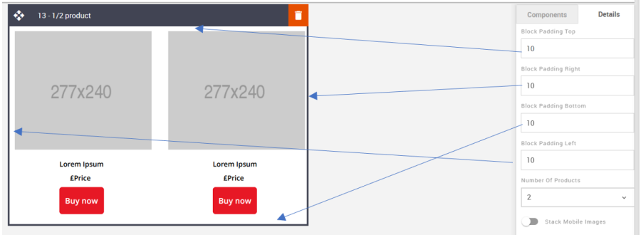
Padding
This refers to the space between the content of the block and its border. This can be edited in the Details Tab.
Option | Details | Default |
|---|---|---|
Padding | Top | 10 |
Right | 10 | |
Bottom | 10 | |
Left | 10 |
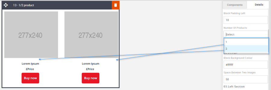
Number of Products
Use the drop-down to select the number of product tiles.
Option | Details | Default |
|---|---|---|
Number of Products | 1 | 2 |
2 |
Stack Mobile Images
Changing the toggle will set the product tiles to stack in mobile or not.
Option | Details | Default |
|---|---|---|
Hide/Show Stack Images | Stack Mobile Images | Show |
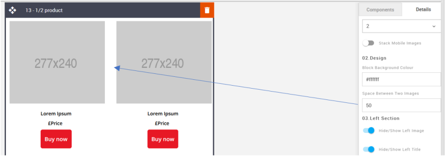
Block Background Color
Used to change the block background color. Only use HEX color values. HTML email only recognizes 6-digit long-hand versions and has patchy support for shorthand versions.
Option | Details | Default |
|---|---|---|
Background Color | Block Background Color | #ffffff |
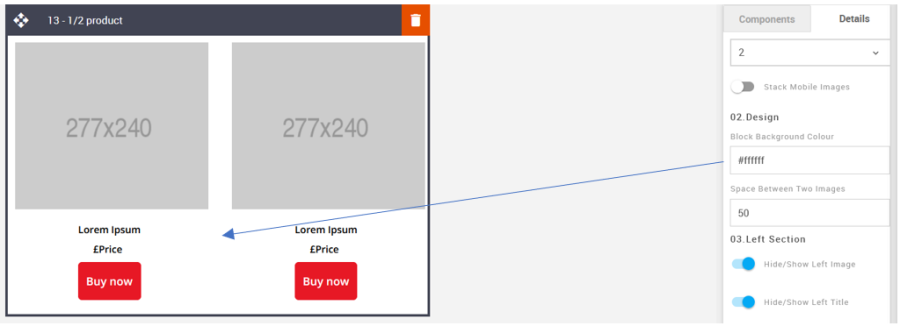
Space between Two Images
It allows you to change product spacing.
Option | Details | Default |
|---|---|---|
Space | Space Between Two Images | 50 |
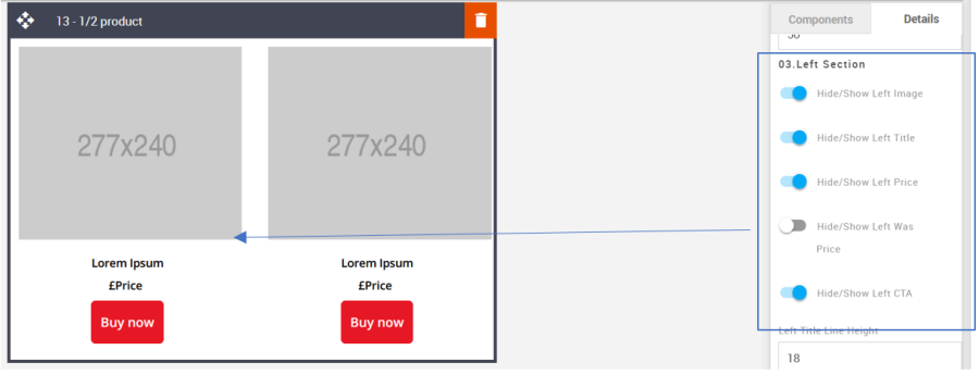
Left & Right Section - Hide/Show
Use the toggles to hide or show all the different elements. All the elements are independent of one another.
Option | Details | Default |
|---|---|---|
Left Section Hide/Show | Image | Show |
Title | Show | |
Price | Show | |
Was Price | Hide | |
CTA | Show |
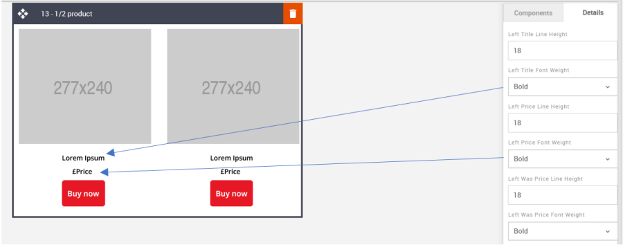
Left & Right Section - Line Height
Used to change the text line height.
As with all text, please be sure the minimum line height value is not less than 4px higher than the font size. For example, if the font size is 18px, the line height should not exceed 22px.
Option | Details | Default |
|---|---|---|
Left Section Line Height | Title | 18 |
Price | 18 | |
Was Price | 18 |
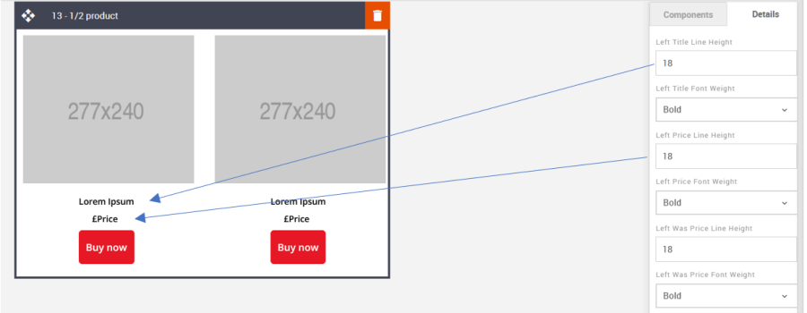
Left & Right Section - Font Weight
Used to change the font weight for the text elements. All are independent of one another.
Option | Details | Dropdown | Default |
|---|---|---|---|
Left Section Font Weight | Title | Bold/Normal | Bold |
Price | Bold | ||
Was Price | Bold |
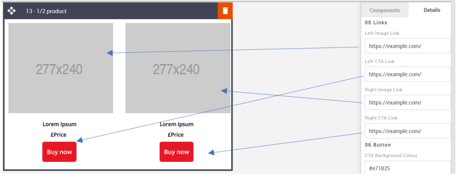
Links
It allows you to add the link to the image and CTA button.
Option | Details | Default |
|---|---|---|
Links | Left Image | Blank |
Left CTA | https://www.example.com | |
Right Image | Blank | |
Right CTA | https://www.example.com |
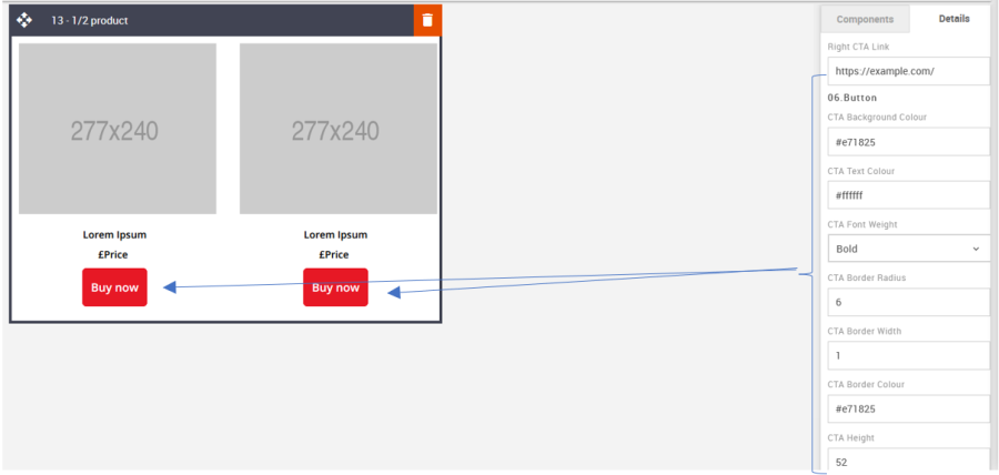
CTA
All CTAs have multiple styling options. As with all colors, please use HEX values. These CTAs are not independent. Changing the setting will change the styles for both CTAs.
Option | Details | Default |
|---|---|---|
CTA | Background Color | #e71825 |
Text Color | #ffffff | |
Font weight | Bold | |
Border radius | 6 | |
Border width | 1 | |
Border Color | #e71825 | |
Height | 52 |
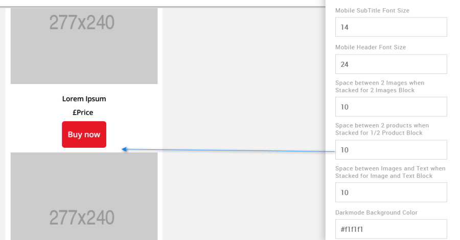
Space between two Products
This option edits the space between images on mobile when stacked. It will need to be updated using the options in the Advanced tab.
Option | Details | Default |
|---|---|---|
Space between two Product | Space between two Products when Stacked in Mobile | 10 |
Compatibility
Currently, the CTA button curved border does not render in the devices listed below. Instead, the corners will be square.
GMX Chrome Windows 10
GMX Edge Windows 10
GMX Firefox Windows 10
Web.de Chrome Windows 10
Web.de Edge Windows 10
Web.de Firefox Windows 10