The Comparison view in Mapp Intelligence allows you to analyze differences across either time frames or segments, providing insights into trends and user behavior. You must select the type of comparison—time frames or segments—as they cannot be mixed within a single analysis. This ensures clarity and meaningful results for your analysis.
Key Features
Two Types of Comparison:
Time Frame Comparison: Analyze and compare data across different time periods. Examples include:
Last week vs. the week before.
A month vs. the same month last year.
Custom time frames, such as Black Friday to Cyber Monday this year vs. the same period last year, allowing you to compare performance during critical e-commerce sales periods that vary annually.
Segment Comparison: Compare predefined segments (saved filters) to evaluate differences between user groups. Examples include:
New vs. Returning Users: Understand differences in engagement or conversion rates.
Loyal vs. Non-Loyal Clients: Measure how repeat customers interact compared to first-time buyers.
Desktop vs. Mobile Users: Analyze performance across devices.
Flexible Comparison Configurations:
Compare multiple time frames or segments simultaneously (e.g., last week, the week before, and the week prior to that).
Analyze up to five metrics side-by-side for deeper insights.
Tailor your comparison to suit specific use cases and uncover trends across multiple dimensions.
Comparison Metrics:
Both the actual values (e.g., visits, conversions) and comparison metrics (percentage changes) are displayed.
Customize the output to show:
The percentage change only.
Both percentage and absolute changes.
Improved Visibility Options:
Use the expand/collapse symbol in the comparison view to hide or display specific elements.
Simplify the visualization to focus on what matters most.
Understanding the Comparison Metric
The comparison metric (percentage change) is calculated using the right column as the reference value. This shows how much the left column value has changed relative to the reference.
Formula:

((Left Column Value - Right Column Value) / Right Column Value) × 100
Example Calculation:
Visits | ||
|---|---|---|
Previous week | Week before previous week | Percentage Change |
5000 | 4500 | ((5,000 - 4,500) / 4,500) × 100 = +11.1% |
This calculation ensures that the right column serves as the baseline for comparison, helping you assess changes effectively.
Example: Comparing Date Ranges
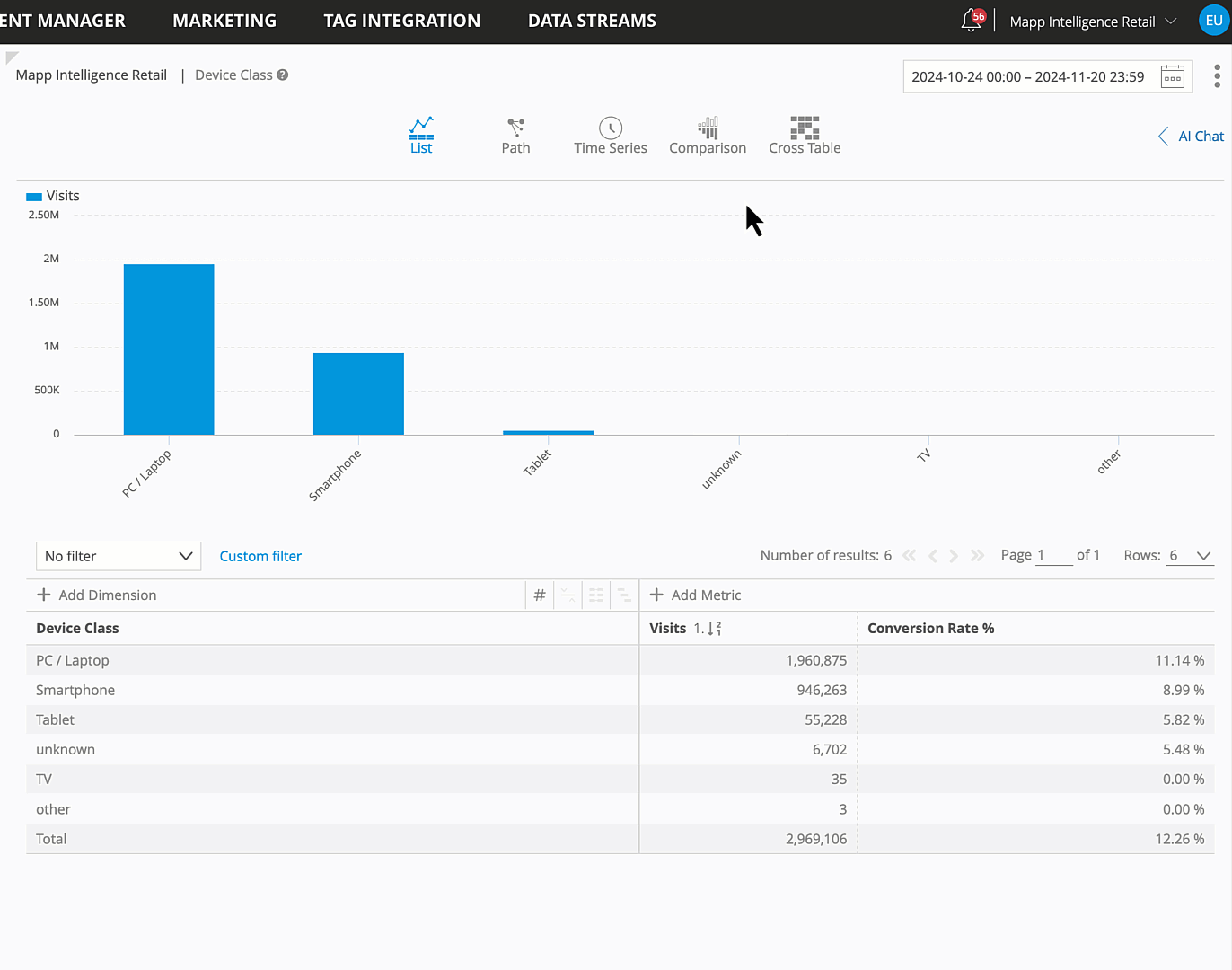
To demonstrate how to use the Comparison view, let’s take a practical example using the Device Class Analysis:
Scenario: You want to compare visits and conversion rates between last week and the week before to analyze how device performance has changed over time.
Step-by-Step Guide
Open the Device Class Analysis (Visitors > Technology > Device Class)
Choose the relevant metrics, such as “Visits” and “Conversion Rate %”
Activate the Comparison View: Switch to the Comparison icon in the top menu.
Comparison Configuration:
Select the Comparison Type: Choose Compare Date Ranges.
Set the Date Ranges: Use the calendar to select:
Previous week as the first range.
Week before previous week as the second range.
Note: If you plan to save this analysis in a report or via bookmarks, it is recommended to use dynamic time ranges (e.g., “Last Week”) instead of fixed dates. Dynamic time ranges will automatically update, ensuring the analysis reflects the relevant time periods each time you view it.
Review the Results: The comparison table will display:
The actual values for each metric (Visits and Conversion Rate) for both time ranges.
A calculated comparison value showing the percentage change.