20 November 2025 We’ve introduced new chart types and a more flexible configuration process in Mapp Intelligence. These updates help you explore insights faster, make it easier to visualize data, and allow chart customization directly within your analysis.
Key Benefits
New chart types: Combined line/bar, area, sunburst, bubble, spider web, plus an expanded stacked column chart that now supports both metric-based and dimension-based stacking.
Flexible configuration: Adjust charts directly in the Visualization Setup panel, even when the data table is hidden.
Pivot-level visualization: Choose how deep your data is displayed without expanding the full pivot table.
Improved accuracy: Updated stacked columns utilize built-in “Rest” logic, ensuring totals align with the table and preventing misleading results.
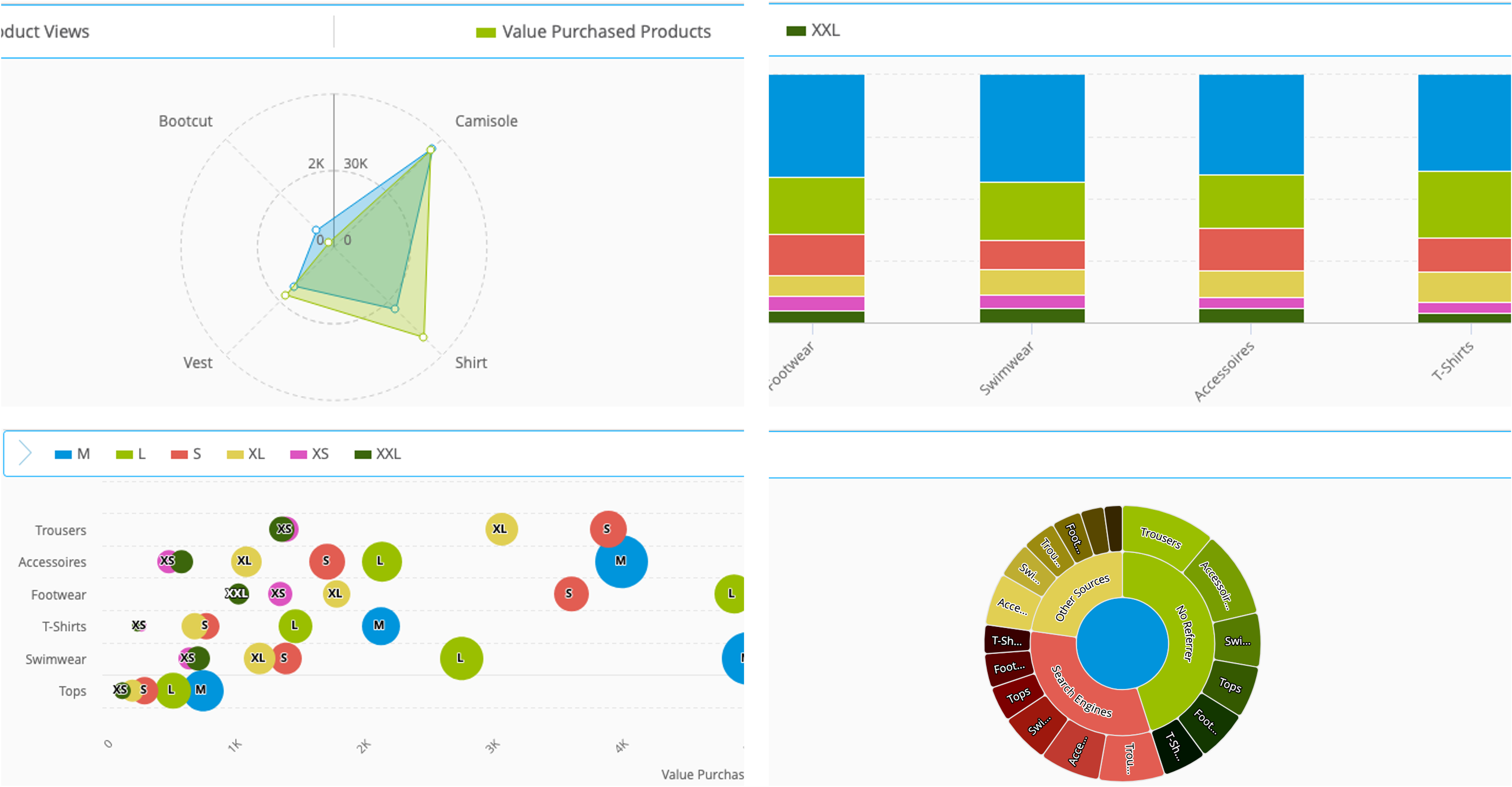
Some of the new available chart types
How Does It Work?
Customize the Visualization
Open your analysis and switch to the Visualization Setup panel.
Select a chart type.
Add one or more metrics and assign them to a primary or secondary axis.
(Optional) Define the pivot level detail to choose how deep the chart should display data (Level 1 = main dimension, Level 2+ = subdimensions).
Optionally hide the table to focus on your chart configuration.
You can switch between chart types or adjust metrics at any time without losing your work.
Bubble Chart
This video demonstrates how to read Bubble Charts, explains the benefits of their use, and illustrates the relationship between position and bubble size.
Spiderweb Chart
This short video explains how the Spiderweb chart works and how to interpret its multi-metric layout.
Stacked Columns Chart
This short video shows how stacked column charts work and how to use both stacking options in your analysis.
For detailed instructions and examples, see the Charts and Chart Configuration documentation.
Availability
This feature is available for all users starting November 20th.