01 Feb 2022 The Mapp Intelligence interface has been fine-tuned for an improved user experience. Apart from optimizing readability, we have updated tooltips, icons, and other elements. Enjoy a clearer and more intuitive user interface.
Key Benefits
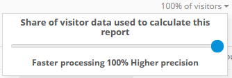
Analyses are now calculated on all data by default, instead of a smaller sample. This way you will always get the most accurate results.
Improved readability thanks to larger font size
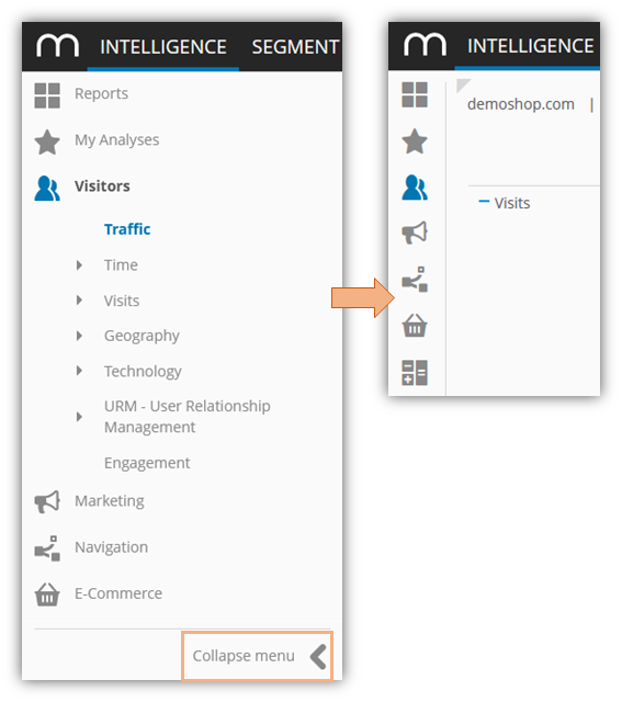
Collapsible menu to obtain more space for analyses
Optimized menu items and tooltips for a more intuitive user experience
Improvement Overview
Analysis calculation on all data by default
Previously, we used a default 20% as sampling size for your analyses. This has changed to 100 % - all data. You can still adjust the sampling slider to use less data for a faster calculation.
Design
Increased font-size
Collapsible menu
New menu icons

New tooltip design
Aligned dropdowns
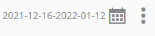
New calendar icon
Custom figures
We removed the beta flag from the Custom Figures menu item.
In the metric editor, we replaced the checkbox for "dimension reference" with a toggle.
Report overview
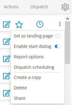
We rearranged the action items in the three dots menu for more clarity.
Availability
This feature is part of our winter update 2022 which went live on February 1st.