Standard Onboarding: Introduction to CMS2 Blocks
- 4 Minutes to read
- Print
- DarkLight
Standard Onboarding: Introduction to CMS2 Blocks
- 4 Minutes to read
- Print
- DarkLight
Article summary
Did you find this summary helpful?
Thank you for your feedback
Introduction to CMS
Standard Content Management System (CMS). A content management system is a tool that helps build Email Templates and Email Messages without needing resources such as an Email Developer or any HTML experience. The pre-built Framework and Blocks enable the creation of email templates that can be styled and reused over & over. As well as creating new and ad-hoc email templates and messages as required.
This document contains a list of new and improved blocks. All blocks have the standard editing features, and some interactive blocks that require a little more setup.
Main Elements
Framework
The Framework provides the HTML foundation for your email messages and determines how messages are displayed on the recipient's devices. The Framework caters to all major email clients (with some exceptions where older versions of Outlook are concerned), and we take a responsive design approach. Therefore, all emails will be mobile-friendly as standard. The Framework is flexible and reusable, and every message requires it.
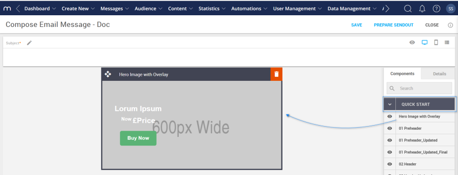
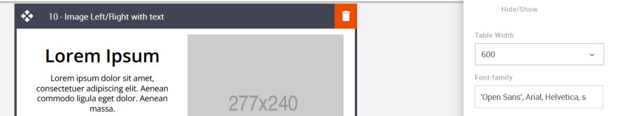
Blocks
A block is a code module containing a specific element of content for an email. An example is the 07 – Hero Image block, where an image can be uploaded, resized, and added to an external link. Each block contains reusable layout, design, and formatting options, which are editable via the Editing Toolbar or in the Details Tab.
All blocks can be dragged from the Components tab and dropped into a Template or Message.
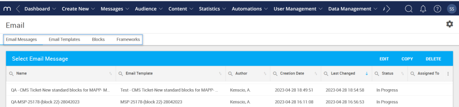
Email Template
Email templates are created using the Framework, and adding blocks in any combination can create layout variations. A good example is a standard weekly Newsletter. A Newsletter layout doesn't generally change from week to week; only the content changes. Creating a Newsletter template saves time, as the layout is already pre-defined. Create a new newsletter message from the newsletter template and add the latest news content in each block. It's quick and easy, flexible, and reusable.
Email Messages
As mentioned above, create a message from a pre-defined template or an ad-hoc email. At this point, adding and removing blocks without affecting the underlying template is still possible. The new message becomes a stand-alone element, not dependent on the template thereafter.
Drag and Drop Editor
The Components and Details Tabs can be found here, where blocks are added to create templates or messages. Both the Template window and Message window utilize the Drag & Drop Editor. Find the required block in the Components Tab list and drag and drop it into the editing window.
Generic Settings
Visual Editor
This is where template and message editing occurs via the details tab or editing toolbar. Examples include formatting text, applying brand Colors, and adding images, links, and buttons.
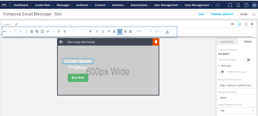
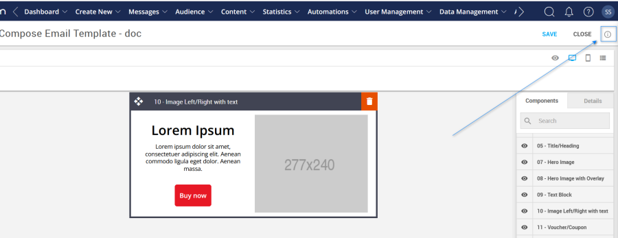
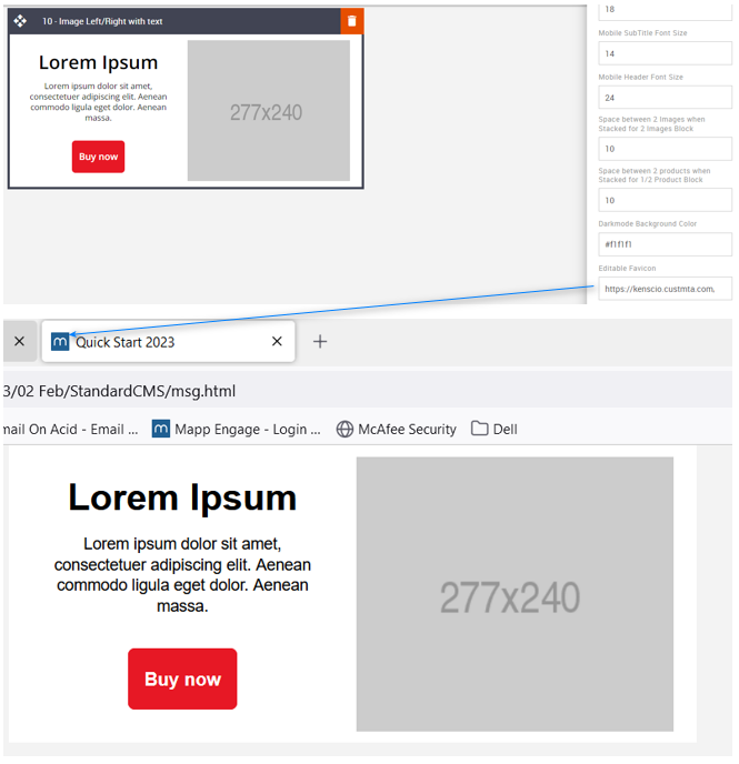
The Advanced Tab settings can be found by selecting the info icon shown in the screenshot below. While creating a template or message, these settings are available but are Framework-level. These settings update variables only found in the Framework and some mobile settings that cannot be accessed via the Details Tab. Hence, these changes apply to all the relevant elements within the current template or message being created.
Template Title
Rename the template with a brand name. This will be displayed on a browser's page tab.
Option | Details | Default |
|---|---|---|
Template | Title | Quick Start 2023 |
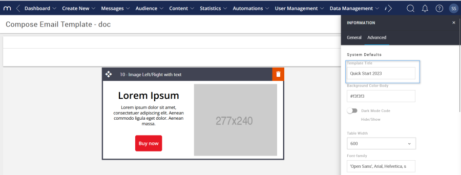
Background Color
Used to change the email background Color.
Option | Details | Default |
|---|---|---|
Background Color | Email background Color | #f3f3f3 |
Dark Mode Code Hide/Show
This toggle hides or shows the dark mode code in the Framework. Some consideration must be applied when deciding which dark mode options will be in place.
Option | Details | Default |
|---|---|---|
Hide/Show | Darkmode Code option | Hide |
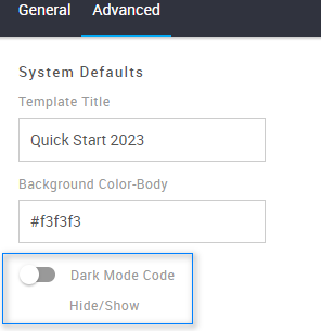
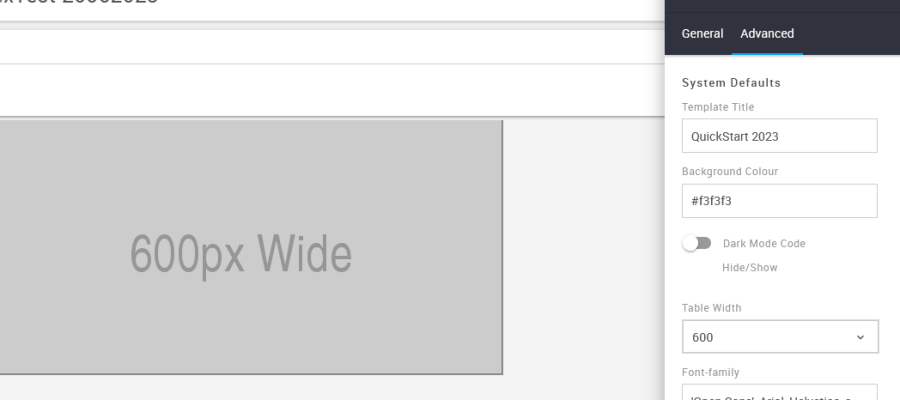
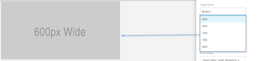
Table Width
Used to select a specific width for a template or message. There are five width options to choose from via a drop-down menu.
Option | Details | Drop-down | Default |
|---|---|---|---|
Width | Table Width selection | 600 | 600 |
650 | |||
700 | |||
786 | |||
800 |
Font Family
This option sets the global font stack for the template or message currently being created. Each individual block can still use a different font.
Option | Details | Default |
|---|---|---|
Font Family | Font Family | 'Open Sans', Arial, Helvetica, sans-serif |
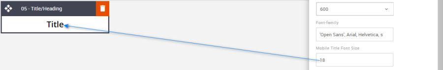
Mobile Title Font Size
Global mobile font size setting for all blocks that use a Title (also known as heading). This is applicable to all blocks that contain a title. Some examples are below.
Option | Details | Default |
|---|---|---|
Font Size | Mobile Title Font Size | 18 |
Mobile SubTitle Font Size
Global mobile font size setting for all blocks that use a SubTitle (also known as a subheading). This is applicable to all blocks that contain a SubTitle.
Option | Details | Default |
|---|---|---|
Font Size | Mobile Subtitle Font Size | 14 |
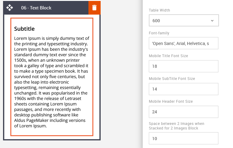
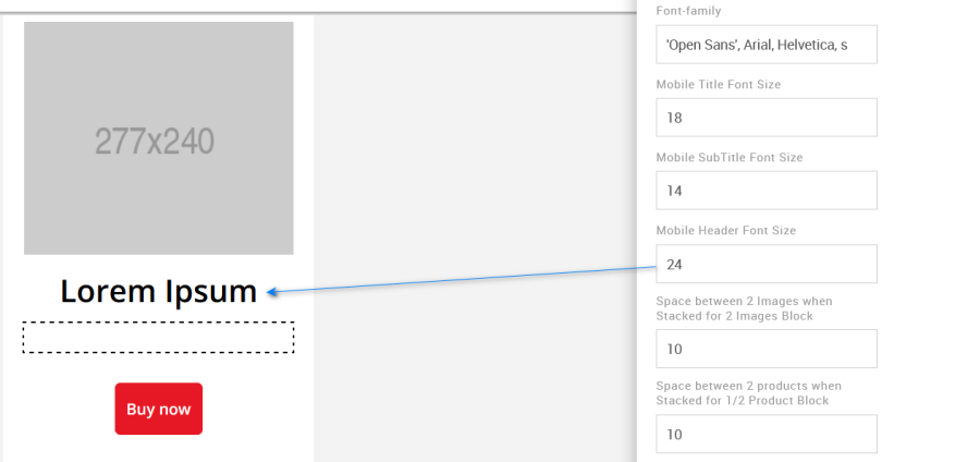
Mobile Header Font Size
Global mobile font size setting for all blocks that use a Header.
Option | Details | Default |
|---|---|---|
Font Size | Mobile Header Font Size | 24 |
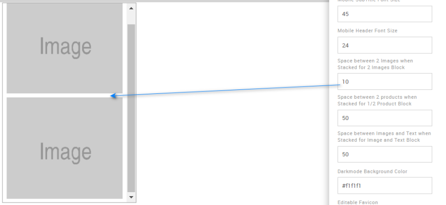
Space between two Images
Use this option to edit the space between the images for the mobile view when images are stacked. Specific to block 12 – 2 images.
Option | Details | Default |
|---|---|---|
Space between two Images | Space between two Images when Stacked in Mobile | 10 |
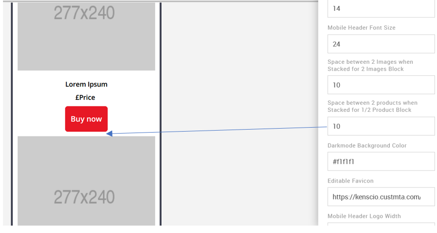
Space between two Products
Use this option to edit the space between the images for the mobile view when they are stacked. It is specific to block 13 – 1 or 2 Products.
Option | Details | Default |
|---|---|---|
Space between two Products | Space between two Products when Stacked in Mobile | 10 |
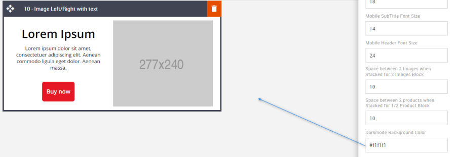
Dark Mode Background Color
It allows you to change the Dark mode body background color. This color will appear when it is viewed in dark mode.
Option | Details | Default |
|---|---|---|
Dark Mode Background Color | Dark Mode Body Background Color | #f1f1f1 |
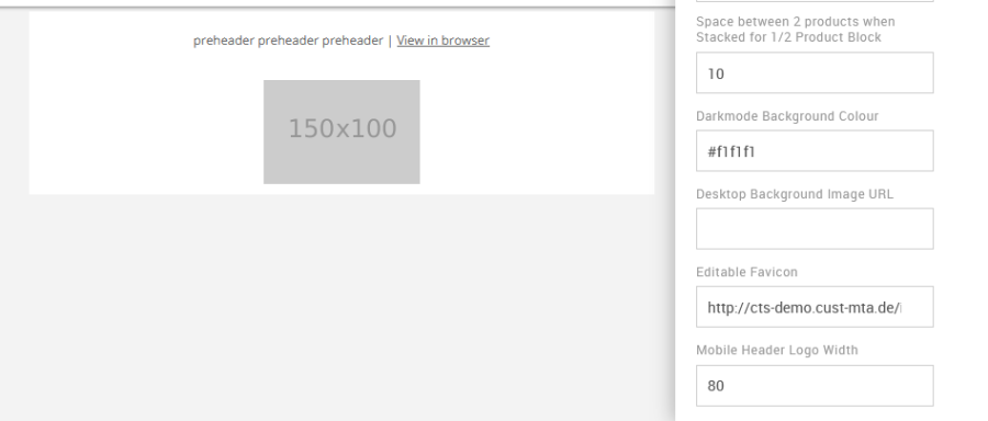
Editable Favicon
This option is used to change the Favicon.
Option | Details | Default |
|---|---|---|
Editable Favicon | Title bar icon in the browser | https://amundsen.shortest-route.com/cts-demo/imgproxy/img/2040334902/mapp_favicon.ico |
Mobile Header Logo Width
It allows you to update the mobile logo width. This is applicable to block 02 – Logo Header.
Option | Details | Default |
|---|---|---|
Logo Width | Mobile Header Logo Width | 80 |
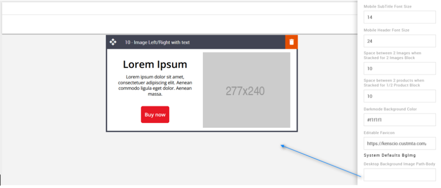
Desktop Body Background Image Path
Used to add an email background image. All blocks will overlay the background image.
Option | Details | Default |
|---|---|---|
Background Image | Desktop Background Image path for Body | Blank |
Compatibility
CTAs with curved corners will not display as curved when placed on top of a background image. When images are configured as background images, this limits the type of functionality that can be applied to them and anything they are overlaid with. This is industry-wide.
Was this article helpful?