Description
This is a unique block and can only be used once per message. This is an interactive Hotspot block giving the recipient the opportunity to interact with the feature directly within the email itself. When a Hotspot is selected a small window appears on the screen. This window can contain all sorts of information – a description of the little black dress that was presented in a hero image, some nutritional information about a product, and so on. Each Hotspot contains a button, too.
Like the Video & Carousel blocks, asset provision is important.
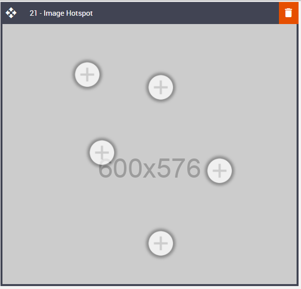
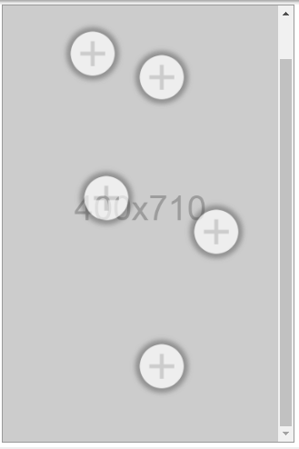
Default block view
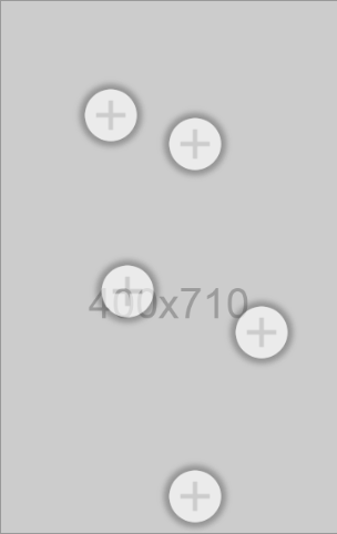
Desktop
Mobile
Formatting options
Padding
As with all blocks, the Video block is no exception when it comes to padding. Padding is the space between the block's content and its border. This can be edited in the Details Tab in the usual way.
Option | Details | Default |
Padding | Top | 0 |
Bottom | 0 |
Number of Hotspots
Select up to 5 Hotspots using the drop-down menu.
Option | Dropdown | Default |
Number Of Hotspots | 1 | 5 |
2 | ||
3 | ||
4 | ||
5 |

Block Background Color
Used to change the block background color. Only use HEX color values. HTML email only recognizes 6-digit long-hand versions and has patchy support for shorthand versions.
Option | Details | Default |
Background Color | Block Background Color | #ffffff |

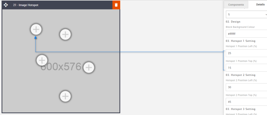
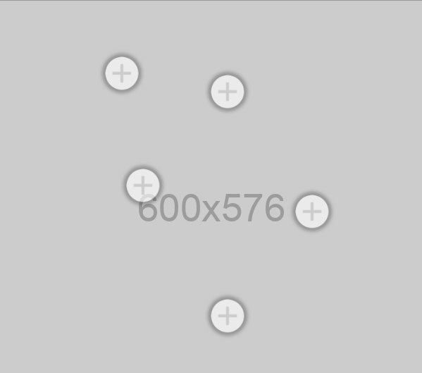
Hotspot 1 Setting
Each hotspot can be positioned independently of one another. Place them at key locations over your hero image without obscuring its intent. Enter a percentage value without adding the % symbol. The block will do that automatically.
All the hotspot options are the same, although they all start off in different default places on the hero image. Here are the defaults for Hotspot Number 1.
Option | Details | Default |
Hotspot 1 Setting | Hotspot 1 Position Left (%) | 25 |
Hotspot 1 Position Top (%) | 15 |
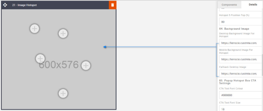
Background Image
The background image is your key feature hero image, over which the Hotspot will be placed. A desktop, mobile, and fallback will be required. Use the default images as image-sizing templates.
Option | Details | Default |
Background Image | Desktop Background Image for Hotspot | https://amundsen.shortest-route.com/cts-demo/public/lpbp/imgPlaceHolder.jsp?widthPH=600&heightPH=576&bgPH=cccccc&fontColor=969696 |
Mobile Background Image for Hotspot | https://amundsen.shortest-route.com/cts-demo/public/lpbp/imgPlaceHolder.jsp?widthPH=400&heightPH=710&bgPH=cccccc&fontColor=969696 | |
Fallback Desktop Image | https://amundsen.shortest-route.com/cts-demo/public/lpbp/imgPlaceHolder.jsp?widthPH=600&heightPH=576&bgPH=cccccc&fontColor=969696 |
Popup Box CTA Settings
It allows you to format the CTA button according to the requirement. Details are below. It takes the color's hexacode as the value to change the color wherever applicable.
Option | Details | Default |
Popup Box CTA Settings | CTA Background Color | #ffffff |
CTA Text Color | #000000 | |
CTA Text Font Size | 18 | |
CTA Text Line Height | 22 | |
CTA Text Font Weight | Bold | |
CTA Border Size | 1 | |
CTA Border Color | #000000 |
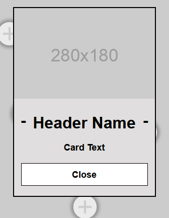
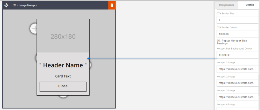
Popup box settings
It allows you to format the Content style as per the requirement. Details below. It takes the hexacode of the color as the value to change the color wherever applicable.
Option | Details | Default |
Popup box settings | Popup Box Background Color | #e0dede |
Popup Title Font Color | #000000 | |
Popup Title Font Size | 32 | |
Popup Title Line Height | 36 | |
Popup Title Font Weight | Bold | |
Sub Title Font Color | #000000 | |
Sub Title Font Size | 18 | |
Sub Title Line Height | 22 | |
Sub Title Font Weight | Bold |
Hotspot Icon
This is where the Hotspot icon can be changed. All Hotspots will use the same image.
Option | Details | Default |
Hotspot icon image | Hotspot Icon | https://amundsen.shortest-route.com/cts-demo/imgproxy/img/2040365428/hotspot_icon.png |

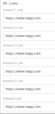
Hotspot Links & Fallback Link
All links are independent.
Option | Details | Default |
Hotspot Links | Link | |
Fallback Link | Link |
Compatibility
As mentioned with the Video and Carousel blocks, there is limited support, but applying a fallback asset for all incompatible devices will bridge the gap.
Interactive view
Desktop | Mobile |
 |  |
Fallback view
Desktop | Mobile |
 |  |