Live Elements in Mapp Intelligence provide near real-time visibility into your data, updating metrics and figures as often as every 30 seconds. This powerful feature allows you to monitor the performance of your campaigns, track website activity, and see how visitors interact with your content immediately. Whether you’re sending out a newsletter or launching a new campaign, Live Elements let you follow user behavior as it happens, helping you make quick decisions and adjust strategies on the fly. Additionally, Live Elements can be useful for integration testing and debugging, allowing you to verify that data is arriving correctly in real-time. Several visualization options are available to display data, making it easy to tailor the information to your specific needs.
1 Available Dimensions and Figures
This chapter gives an overview of the dimensions and metrics that are available for Live Analytics.
The following dimensions and figures are available:
Standard Dimensions | Ad Media |
|---|---|
City | |
Device Class | |
Events | |
External Search Phrases | |
Media | |
Origin Type | |
Other sources | |
Products | |
Pages | |
Search Engines | |
Social Media Sources | |
Website Goals | |
Custom Parameters and Categories | Event Parameters (1,2) |
Page Parameters (1,2) | |
Campaign Categories (2) | |
Content Groups (2) | |
Media Categories (2) | |
Product Categories (2) | |
Qty Event Parameter (1) | |
Qty Page Parameter (1) | |
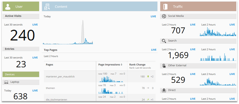
Standard Figures | Active Visits (last 30 seconds) |
Campaigns Clicks | |
Clicks | |
Conversion Value | |
Conversions | |
Entries | |
Media Run Time | |
Media Views | |
Order Value | |
Page Impressions | |
Play Duration | |
Qty External Search Phrases | |
Qty Orders | |
Qty Product Added to Cart | |
Qty Product Views | |
Qty Purchased Products | |
Qty Sources | |
Rank in Basket | |
Run Time | |
Value Product Added to Cart | |
Value Product Views | |
Value Purchased Products |
1 The parameters are defined in the configuration of Live Analytics.
2 The number of available elements depends on the package booked.
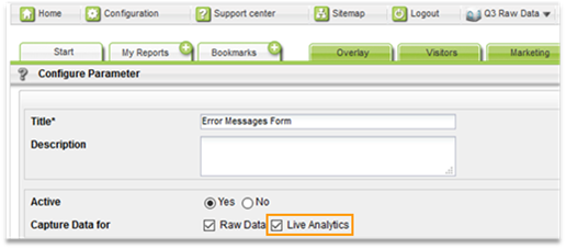
How can I activate parameters for Live analytics?
Open the configuration of the corresponding parameter at Mapp Q3 > Configuration > Custom Parameter > [Type of Parameter].
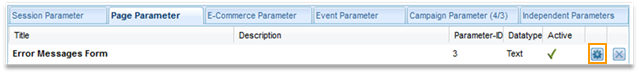
Activate the option „Live Analytics“.
2 Live Elements
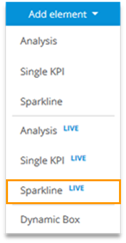
A number of report elements can be used to display Live data. Elements can be added to reports using the Edit mode.

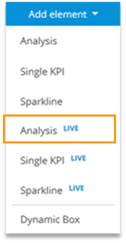
The following Live elements can be added to a report:
Analysis LIVE
Single KPI LIVE
Sparkline LIVE
2.1 Analysis LIVE
Analysis Live shows a dimension and further figures.
You can choose between the following analysis periods:
„Today“
„Last 2 Hours“
„Last 60 Minutes“
„Last 30 Minutes“
„Last 30 Seconds“
One analysis period is chosen for the whole analysis.
Nevertheless, you can choose different time periods for the single metrics via „configure metric.“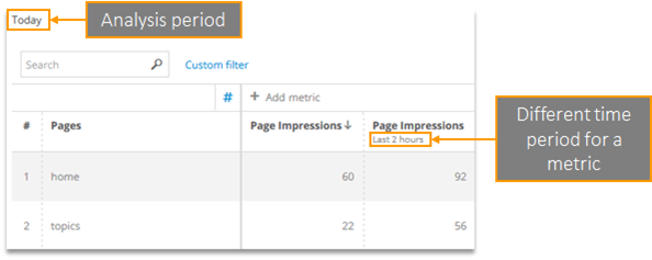
In Live analyses, formulas and metrics can be visualized in different ways.

The visualization can be activated in the context menu of a metric or formula at „Visualization.” „Sparkline“ and „Rank Change“ are available exclusively in live analyses. Therefore, we will explain them in more detail on the next pages.
Further information on the other visualizations can be found in the chapter User Interface.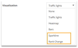
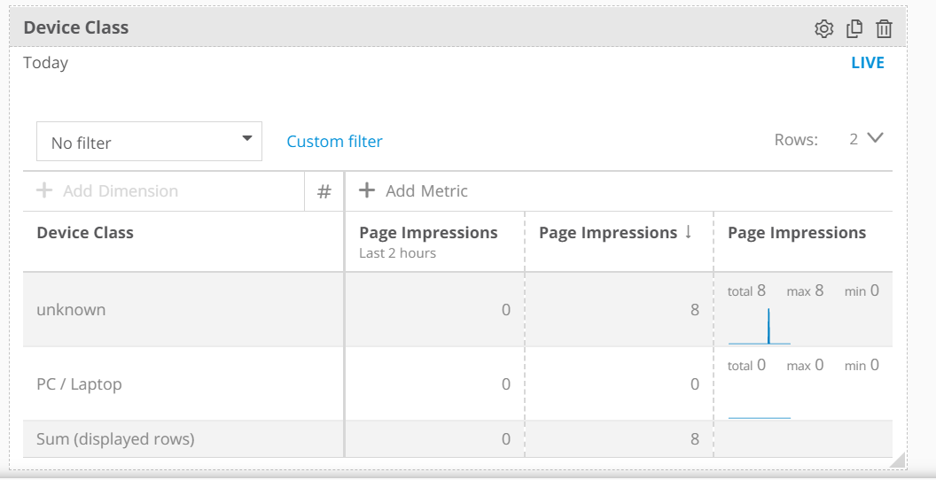
You may notice the sum row for your live analytics is different than expected. This is because the sum here is only for the displayed rows.
2.1.1 Visualization „Sparkline“
The sparkline shows the development over time of the metric or formula in the chosen analysis period.
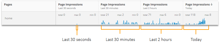
The sparkline is updated depending on the time period of the metric or formula.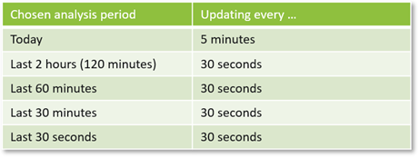
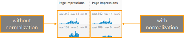
The options „Normalize“ and „Show absolute numbers“ allow for further adaption: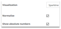
Show absolute numbers:
total: the overall number in the chosen time period
max: the maximum number in the updating interval
min: the minimum number in the updating interval
Normalize:
All sparklines in this column relate to the same range of values.
The lowest and highest values are chosen as the minimum and maximum for the whole column, respectively.
2.1.2 Visualization „Rank Change“
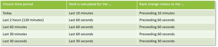
The „Rank Change “ visualization shows how the rank of a metric or formula develops.

The rank may relate to another time period than the chosen one.
Example:

The metric relates to the last 30 minutes, but the rank refers to the previous 60 seconds.
Overview of the time periods for rank calculation and rank change:
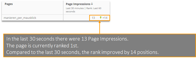
Reading Example:
2.2 Single KPI LIVE
„Single KPI Live“ shows the value of a single metric or formula.

The following analysis periods are available:
Today
Last 2 hours (120 minutes)
Last 60 minutes
Last 30 minutes
Last 30 seconds

Data is updated every 30 seconds.
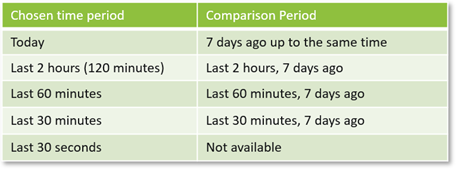
Additionally, a comparison can be activated. The following time periods are used for comparison:
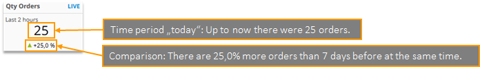
Reading Example:
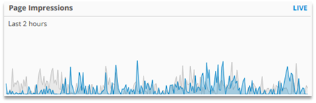
2.3 Sparkline LIVE
„Sparkline Live“ shows the development of a custom metric or formula over time.
The following time periods are available:
Today
Last 2 hours (120 minutes)
Last 60 minutes
Last 30 minutes
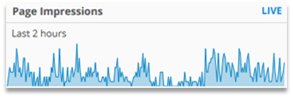
The data is updated every 30 seconds, except for the time period „Today, “when it is updated every 5 minutes.
Additionally, a comparison can be activated. The following time periods are used as comparison periods:
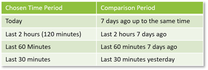
The comparison period is shown as a grey line: