Description
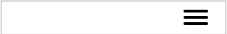
The Hamburger-style navigation has been around for several years but isn't fully compliant. In essence, it looks the same as the standard navigation mentioned above in desktop view, but for mobile, it offers three horizontal lines resembling a hamburger (which is where the name came from). Where devices are incompatible the standard-style navigation will replace the hamburger.
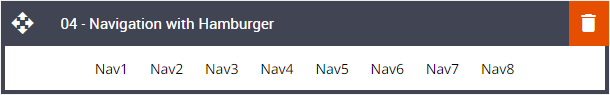
Default block view
Desktop
Mobile
Formatting options
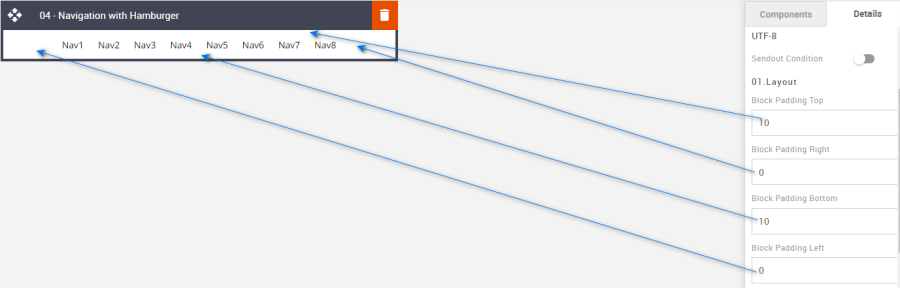
Padding
This refers to the space between the block's content and its border. This can be edited in the Details Tab.
Option | Details | Default |
|---|---|---|
Padding | Top | 10 |
Right | 0 | |
Bottom | 10 | |
Left | 0 |
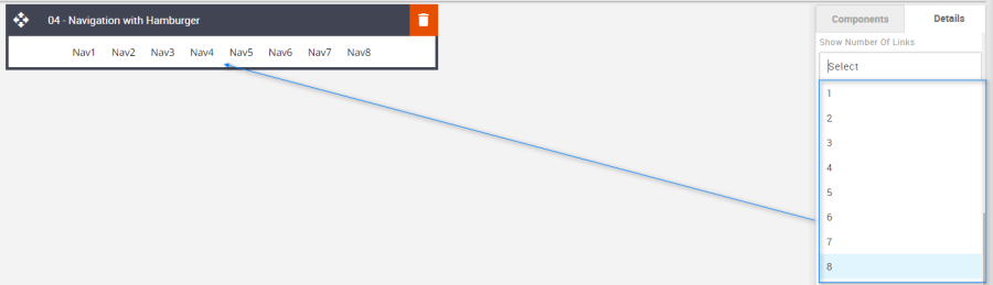
Show Number of Links
Used to change the number of Navigation links required.
Option | Details | Default |
|---|---|---|
Show Number of Links |
| 8 |
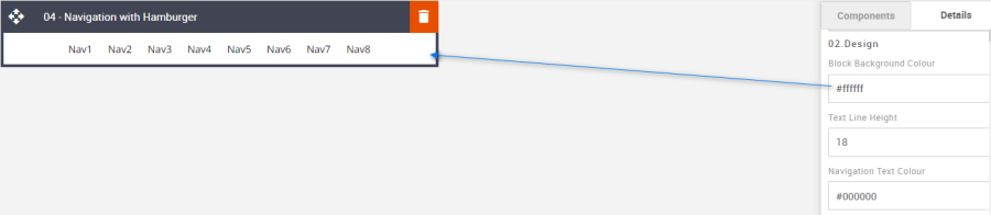
Block Background Color
Used to change the block background color. Only use HEX color values. HTML email only recognizes 6-digit long-hand versions and has patchy support for shorthand versions.
Option | Details | Default |
|---|---|---|
Background Color | Block Background Color | #ffffff |
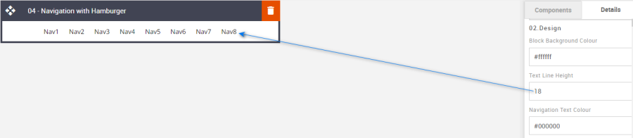
Line Height
Used to change the text line height.
As with all text, please be sure the minimum line height value is not less than 4px higher than the font size. For example, if the font size is 18px, the line height should not exceed 22px.
Option | Details | Default |
|---|---|---|
Line Height | Text | 18 |
Navigation Text Color
Used to change the navigation text color.
Option | Details | Default |
|---|---|---|
Navigation Text Color | Navigation Text | #000000 |

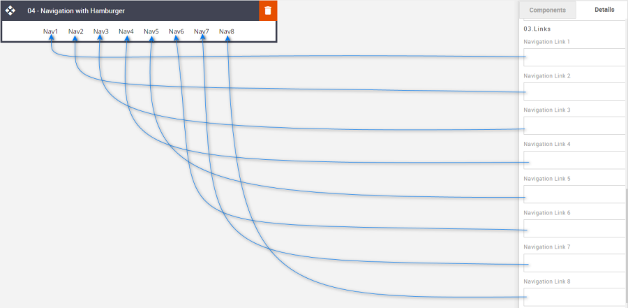
Links
Used to enter each navigation's respective external link.
Option | Details | Default |
|---|---|---|
Links |
| Blank |
Compatibility
For those devices that are incompatible the standard navigation will display.