The Crosstable view in Mapp Intelligence allows you to analyze the relationships between two dimensions simultaneously, providing a detailed breakdown of data. While it is more limited compared to the Multi-dimensional analysis (Pivot Table), the Crosstable excels in visualizing changes through its heatmap chart, making it easier to identify trends and patterns.
Key Features
Two-Dimensional Analysis: Analyze exactly two dimensions side-by-side to uncover relationships and trends.
Example: Weekdays by Hours to identify patterns in user behavior, such as peak activity times or low-traffic hours.
Flexible Metric Selection: Choose a single metric to analyze, such as:
Visits
Qty Orders
Bounce Rate
Filtering Options: Apply filters to narrow down your analysis to specific elements (e.g., focus on specific weekdays or hours with the highest traffic).
Chart Visualization: The Crosstable offers a heatmap visualization that highlights changes in the selected metric.
High-intensity periods (e.g., hours with high visits) are shown in red or darker colors, while low-intensity periods are shown in lighter colors.
Configurable Display Options: Adjust the number of elements displayed for each dimension to suit your analysis needs.
Example: Using Crosstable in Weekdays Analysis
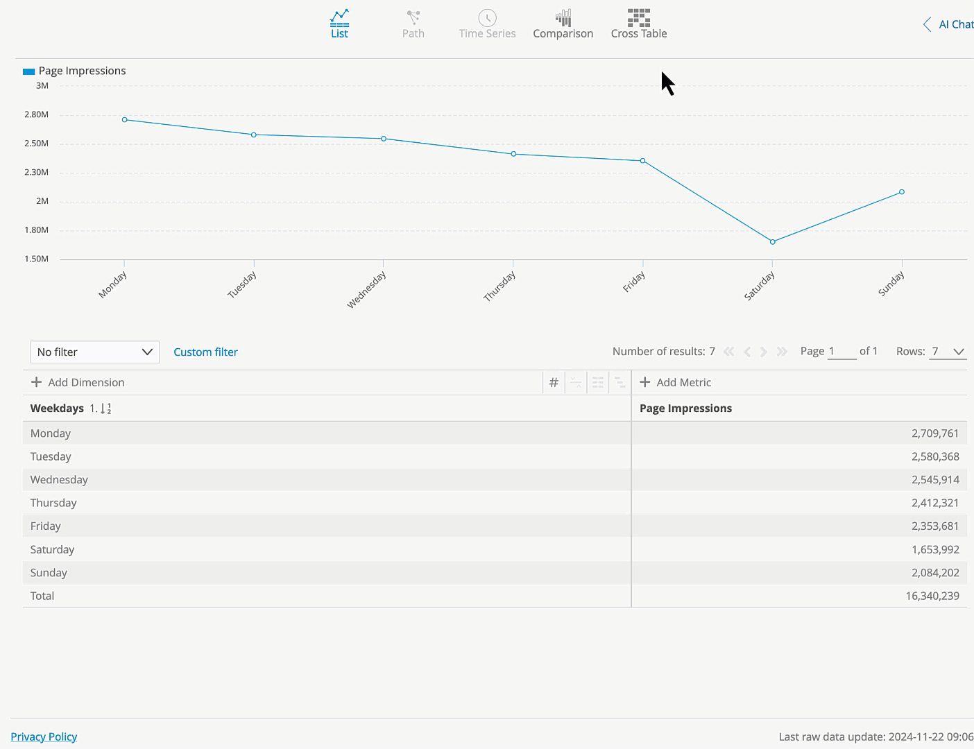
To demonstrate how to use the Crosstable view, let’s take a practical example using the Weekdays Analysis.
Scenario: You want to analyze how visits vary by hour for each weekday, helping you identify peak activity times for your website.
Step-by-Step Instructions
Open the Weekdays Analysis (Visitors > Time > Weekdays)
Activate the Crosstable View: Click on the Crosstable icon in the top menu to change the view.
Select the Second Dimension: In the Crosstable settings, choose Hours as the second dimension to cross-analyze with weekdays.
Choose a Metric: Select Visits as the single metric to display in the Crosstable.
Review the Heatmap Visualization: The Crosstable heatmap is arranged with a color gradient:
Blue indicates low values (e.g., fewer visits during a given hour).
Red indicates high values (e.g., peak traffic hours).
Use mouseover to see the exact value for each cell in the heatmap, providing precise insights into traffic patterns.