This page explains two complementary ways to visualize your data. Charts above the table help you understand patterns and trends at a glance, while in-table visual elements such as colors or bars make value differences easier to spot directly within the data grid.
1 Using Charts for Data Visualization
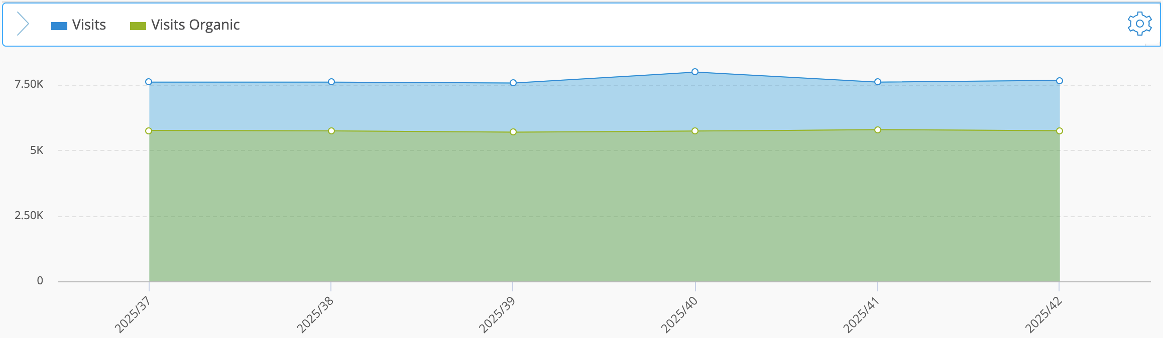
Charts visualize the same data shown in the data table and make complex analyses easier to interpret. They help you identify trends and relationships that are not immediately visible in raw numbers. Many chart types support multiple axes, allowing you to compare metrics that use different scales.
Charts are interactive, allowing you to move the cursor over data points to view exact values or additional details. They also support area-based zooming. You can click and drag within a chart to select a specific area. The chart automatically zooms into the selected range, making it easier to analyze dense data or overlapping elements. You can reset the zoom at any time to return to the original view.
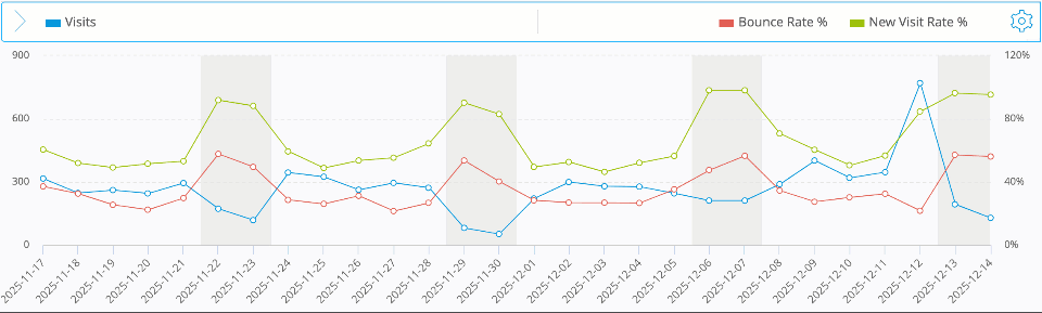
The chart reacts to user interaction: hovering reveals exact values, and selecting an area zooms into the chosen range.
Mapp Intelligence provides several types of charts that help you visualize data and identify patterns more effectively.
1.1 Visualization Setup
You can adjust all chart settings in the Visualization Setup panel.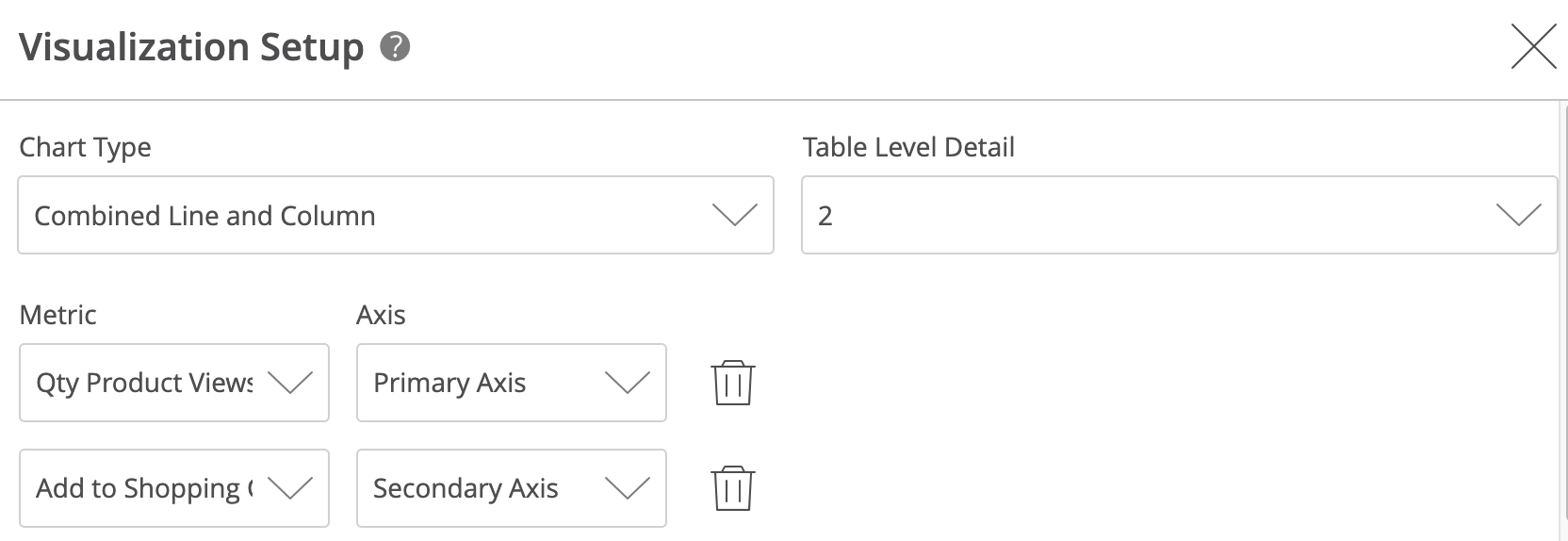
Option | Description |
|---|---|
Chart Type | Select how the data is visualized. |
Table Level Detail | Defines the depth at which the data is displayed in the chart. Level 1 shows the first dimension, Level 2 includes sub-dimensions, and so on. This option is only available when your analysis contains more than one dimension. |
Metric | Choose one or more metrics to visualize. |
Axis | Assign each metric to the Primary Axis or Secondary Axis. This helps compare metrics that use different scales. |
Add / Remove Metric | Use Add to include another metric, or the trash icon to remove one. |
Open your analysis and switch to the Visualization Setup panel.
Select a chart type.
Add one or more metrics and assign them to a primary or secondary axis.
(Optional) Define the pivot level detail to choose how deep the chart should display data (Level 1 = main dimension, Level 2+ = subdimensions).
Optionally hide the table to focus on your chart configuration.
You can switch between chart types or adjust metrics at any time without losing your setup.
1.2 Chart Types Overview
Chart Type | Description |
|---|---|
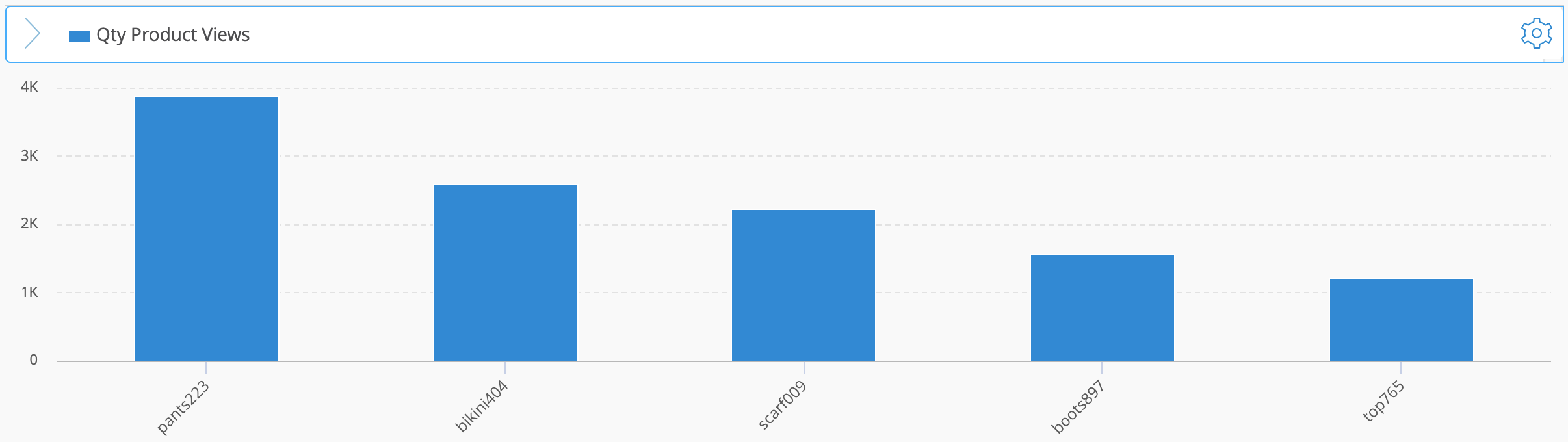
Columns
| Vertical columns for comparing metric values across the items in your table. |
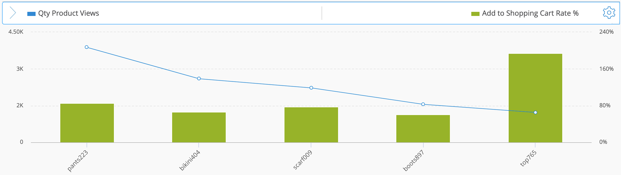
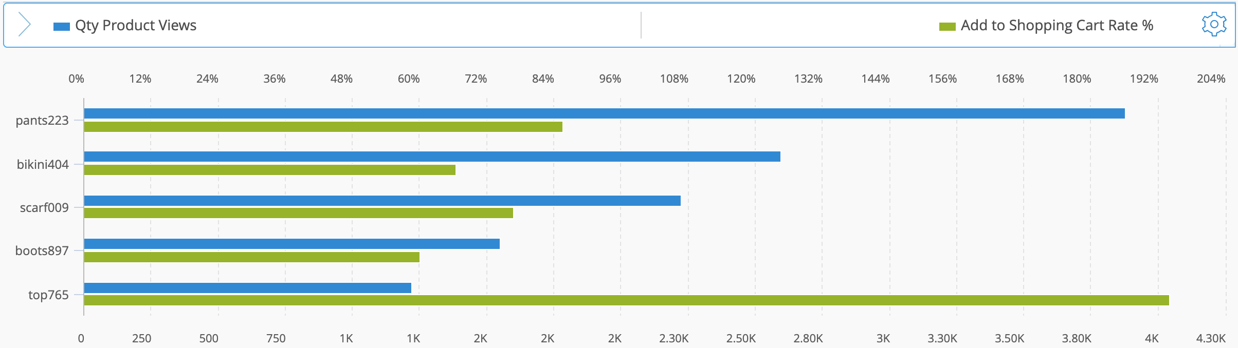
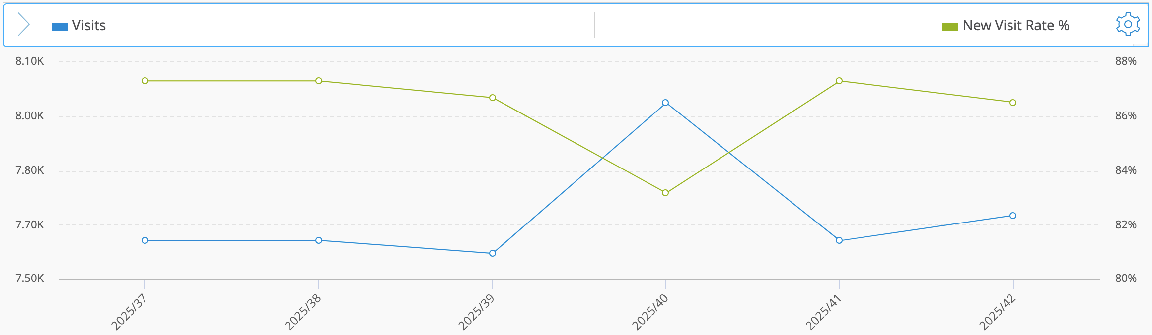
Combined Line and Column
| Displays one metric as columns and another as a line using a secondary axis. |
Bars
| Horizontal bars for comparing metric values across the items in your table. |
Bubble
| Shows three metrics at once (X-axis, Y-axis, bubble size) with an optional color mapping based on a dimension or metric. More information below. |
Line
| Lines for comparing metric values across the items in your table. |
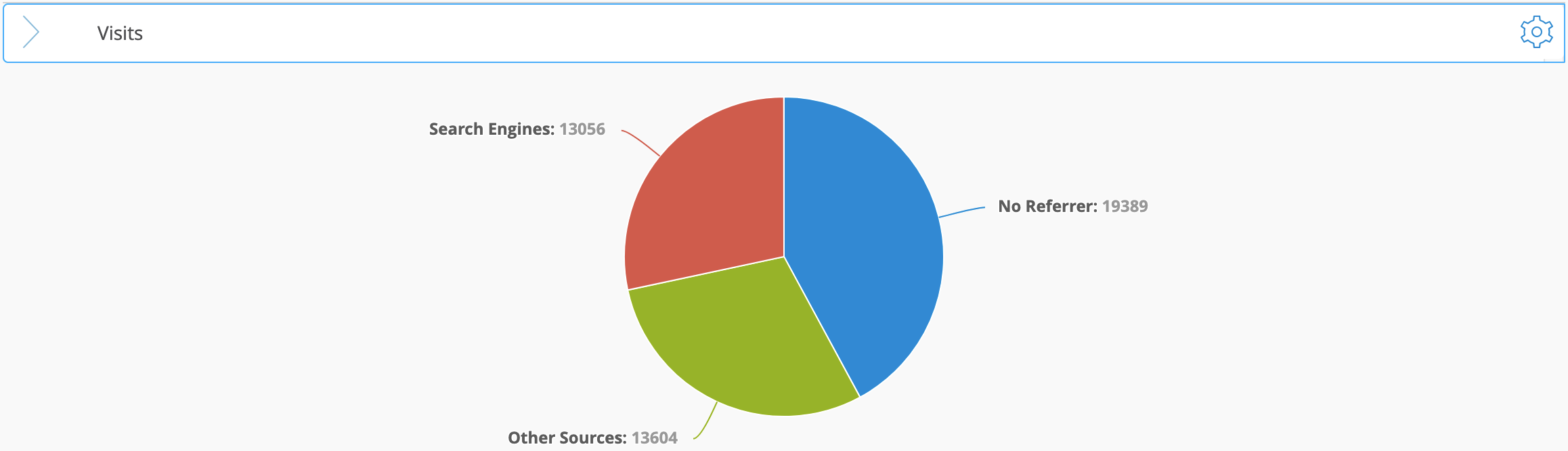
Pie
| Shows the relative share of each item within a single metric. |
Area
| Filled areas for comparing metric values across the items in your table. |
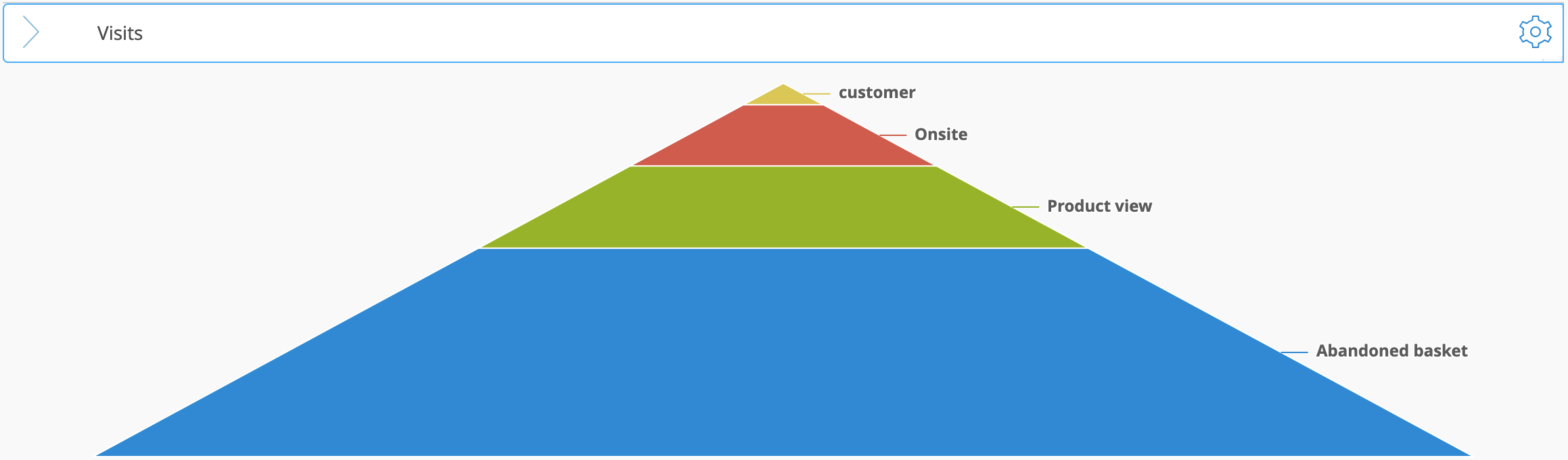
Pyramid 2D
| Symmetric stacked layers showing the metric values of all dimension items. |
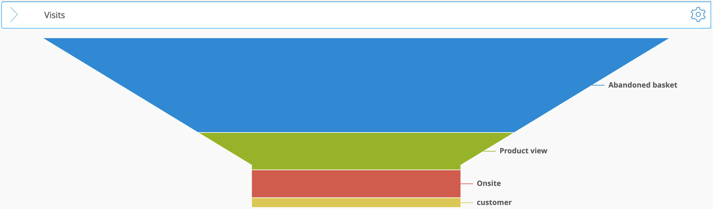
Funnel 2D
| Asymmetric stacked layers showing the metric values of all dimension items in a funnel shape. |
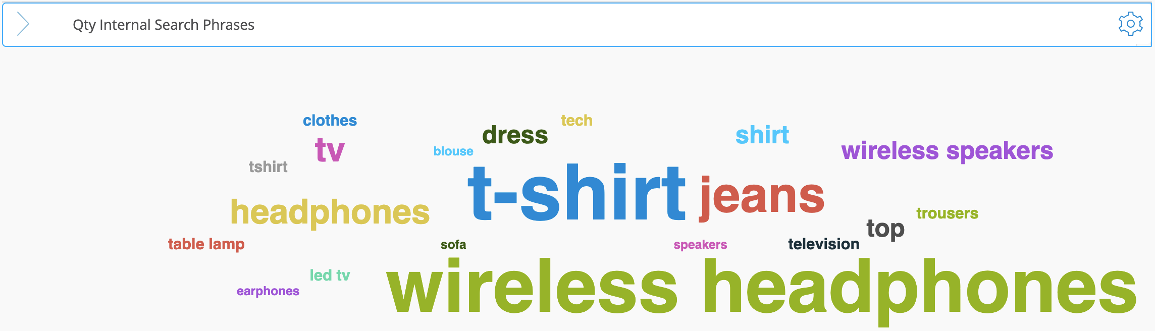
Cloud
| Displays the relative importance of items, such as top search terms or best-selling products. The size of each word reflects the metric value. |
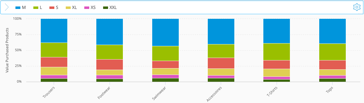
Stacked Columns
| Shows relative shares by normalizing each stacked column to 100%; an automatic “Rest” value can be added. More information below. |
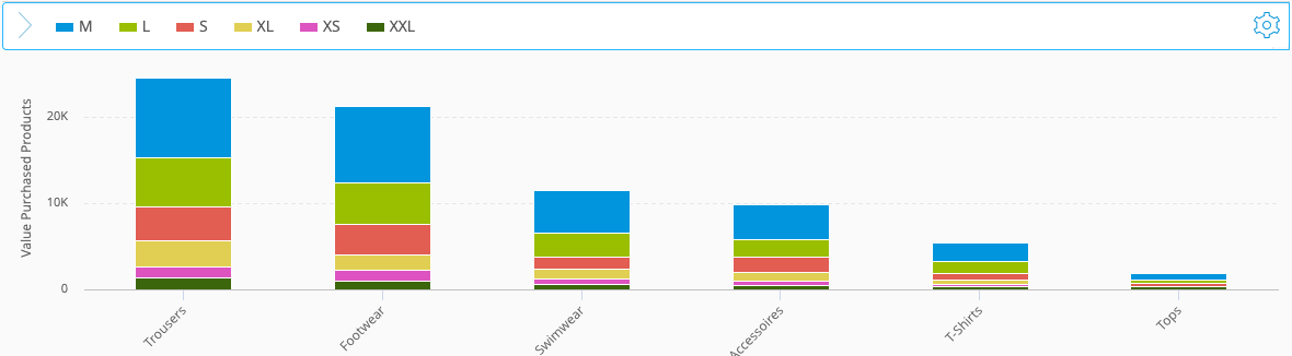
Stacked Columns (Absolute)
| Shows how metric or dimension values stack to the absolute total for each item; an automatic “Rest” value can be added. More information below. |
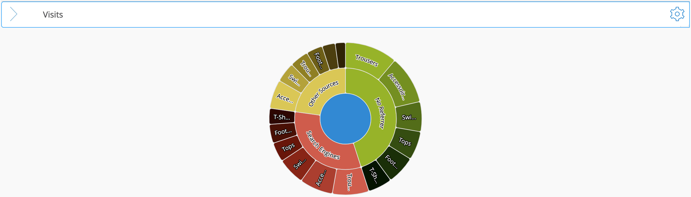
Sunburst
| Shows hierarchical levels as concentric rings. |
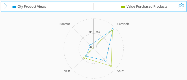
Spiderweb Line
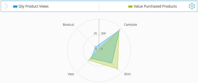
| Radial lines for comparing metrics or items across axes. More information below. |
Spiderweb Area
| Radial filled areas for comparing metrics or items across axes. More information below |
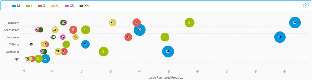
1.2.1 Bubble Chart
This brief video shows how to read Bubble Charts and understand the relationship between position and bubble size.
1.2.2 Spiderweb Chart
This short video explains how the Spiderweb chart works and how to interpret its multi-metric layout.
1.2.3 Stacked Columns Chart
This short video shows how stacked column charts work and how to use both stacking options in your analysis.
2 Using In-Table Visualizations
Mapp Intelligence provides tools to visualize metrics directly within the data table, helping you quickly identify trends and differences:
.png)
Traffic Light Visualization
Uses three colors (red, orange, green) to highlight values based on predefined thresholds.
Heatmap Visualization
Applies a gradient of five colors (from light blue to dark blue) to emphasize variations across metrics.
Bar Visualization
Displays horizontal bars within the data cells to visually represent the magnitude of values. This visualization is particularly useful for comparing metrics side by side within the same analysis.
2.1 Coloring
Mapp Intelligence offers two options to visually differentiate your data using color schemes.
Automatic Coloring:
Coloring is automatically based on the values visible in the data table, using the lowest and highest values to calculate a range. This method quickly highlights outliers and trends based on the data you’re currently viewing.
Example of Automatic Coloring Using the Traffic Light Visualization
The Traffic Light visualization utilizes automatic coloring to highlight data within a predefined range.
.png)
Here’s how it works when the target value is set to “minimum”:Determining the Range
The system identifies the minimum value (e.g., 50%) and the maximum value (e.g., 100%) within the dataset.
The range is calculated as the difference between the maximum and minimum values:
Range = Max value - Min value = 100% - 50% = 50%
Color Assignment Based on Value Ranges
The range is divided into three equal segments, with each segment assigned a color:
Green: Represents the lowest range of values (e.g., 50%-66.7%).
Orange: Represents the middle range of values (e.g., 66.7%-83.3%).
Red: Represents the highest range of values (e.g., 83.3%-100%).
Example Breakdown
Values between 50% and 66.7% are colored green.
Values between 66.7% and 83.3% are colored orange.
Values above 83.3% are colored red.
Manual Coloring:
With manual coloring, you can set your own thresholds for what is considered good or bad. This is especially useful if you have specific targets in mind. For instance, if your analysis shows values below your target, automatic coloring might still indicate them as positive based on relative scaling. Manual coloring allows you to define these thresholds, ensuring that the colors align with your actual performance goals.
Example of Manual Coloring Using the Traffic Light Visualization
The Traffic Light visualization uses manual coloring to highlight data based on a predefined range.
.png) Here’s how it works:
Here’s how it works:Defining Custom Thresholds and Target Value
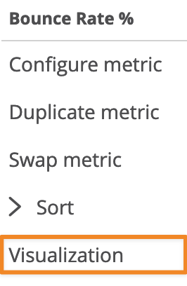
To configure manual coloring, right-click on a single metric to open the context menu and select Visualization.
In the settings, you can manually set your own minimum and maximum values.
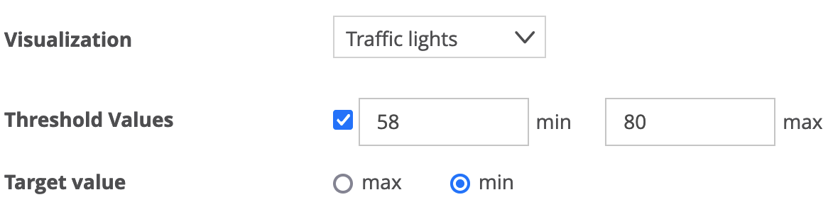
In this example, the minimum value is set to 50% and the maximum value is set to 80%.You also choose a target value, which determines whether higher or lower values are better. In this example, the target is set to min because we are measuring Bounce Rate—lower values are more desirable.
Determining the Range
The value range is calculated as the difference between the maximum and minimum values:
Range = Max value - Min value = 80% - 50% = 30%
Color Assignment Based on Manual Thresholds
Since the target value is set to MIN, the system assigns colors as follows:
Green: Represents the lowest range of values (e.g., below 60%).
Orange: Represents the middle range of values (e.g., 60% to 70%).
Red: Represents the highest range of values (e.g., above 70%).
Example Breakdown
Values below 60% are colored green.
Values between 60% and 70% are colored orange.
Values above 70% are colored red.
This approach ensures your analysis aligns with your specific performance targets, avoiding misinterpretations that could occur with automatic coloring.
2.2 How to Apply Visualizations
Right-click within the data table to open the context menu and select Visualization.
.png)
Select the visualization type (Bar, Traffic Light, or Heatmap).
For manual coloring, set your threshold value.
Adjust the target value to specify whether a higher or lower value is considered better:
Use MIN if lower values are preferable (e.g., Bounce Rate).
Use MAX if higher values are desirable (e.g., Conversion Rate).
Visualizations are not available in multi-dimensional analyses (pivot tables).